Before and After (click on any image to enlarge)
By no means are we criticizing the before renderings in this section. We are merely pointing out the diferences between a good design or advertsement and one that truly commands reults. We have no idea who created the before (and we wouldn't call them out on the carpet anyway), this is to merely educate our viewing audience on what they should come to expect in great design.
Recreating before and after's doesn't just adhere to just print, web design or logos. We have redesigned interior and exterior spaces, buses, truck fleets and a lot of other unconventional redesigns. We once created a grand piano to look like it was made from jelly beans for a major candy company.

Before
Those of you familiar with advertising in media such as a newspaper know how expensive ad space is, especially a half or full page color advertisiement.
Many times the sales team at the local newspaper offer their advertisers free design, or at least design at a cheap price.
These designers work under such tight deadlines, never get to know or understand what the product really is or how to "connect" with the target demographics that produce results.
You will notice that this expensive ad gets lost on a page of multiple ads for numerous reasons...
After
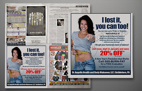
We've all seen "Before and After" weight loss ads...LA Weight Loss, Weight Watchers, ad infinitum. It's been done to death.
The product that is being offered is not weight loss, but feeling good about ones self, feeling attractive, being healthy. There needs to be a personal connection. The ad asks a question...but we as consumers want answers and solutions.
The ad to the right starts with a great "hook" line. It is followed by an explanation on how this service works and is beneficial to the consumer. The "call to action" stands out from the rest of the ad and the whole ad uses the ad space for maximum impact.
Before
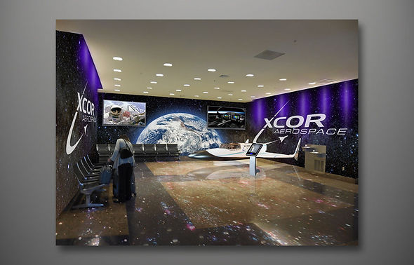
We were approached by Xcor Aerospace to design a space that was being neglegted in the Akron International Airport. They were pitching their new Lynx Suborbital Spacecraft Talk about exciting.
The Lynx is XCOR’s entry into the commercial reusable launch vehicle (RLV) market. This two-seat, piloted space transport vehicle will take humans and payloads on a half-hour suborbital flight to 100 km (330,000 feet) and then return safely to a landing at the takeoff runway.
After
We concepted several ideas, and this was the overall best concept. It soon became the talk of the airport and then the talk of the town.
This seating are which largely went unused became the hub of travelers passing by. They were drawn in like a magnet.
Xcor Aerospace gained more brand recognition andn interest than all their print and web advertising dollars combined.

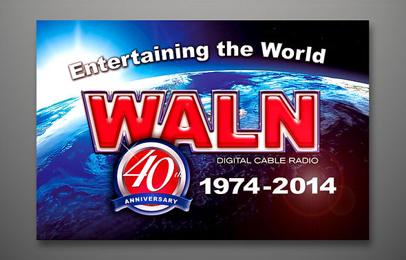
Before
WALN Digital Cable Radio has been a mainstay for music lovers (expecially polka and oldies) for over 40 years.
Their logo had remained unchanged in those 40 years, and that's the sign of branding, creating awareness and recgnition through repitition.
When the Smith Design Agency was approached to refresh the mark and brand for WALN's 40th Anniversary, we jumped at the opportunity, as it was going to be challenging and exciting to give it a fresh look without losing brand retention.
After
After several meetings with "Happy Jack Burns," TSDA decided to just bring the logo into the 21st century, into the now, into the tomorrow.
We changed the font to something very similar to the old font, and then did our "magic" on it. We wanted to ad dimensionality to the logo, to make it more cutting-edge. The background globe was changed to a digitally rendered view of the earth from space.
Lastly we added a "40th Anniversary" seal to the design in order to accomplish all the goals set forth in the creative brief.

Before
When we were contacted by the advertising sales department at Orlando International Airport, they were panicked and short on time. They were doing major renovations to the facility and needed graphics to pitch ad space to United Airlines the next day.
To the right is the best photo they sent to us to manipulate. Needless to say, this was going to be a daunting task.
After
We worked through the evening just trying to make the original picture look as though all the renovations were completed and make the photo look more like it was taken by a professional photographer rather than on an iPhone.
Then we needed to create a compelling ad for United Airlines, Once all of the elements were in place (and we made the deadline), the ad was uploaded to Orlando.
United Airlines ended up signing a two year contract.

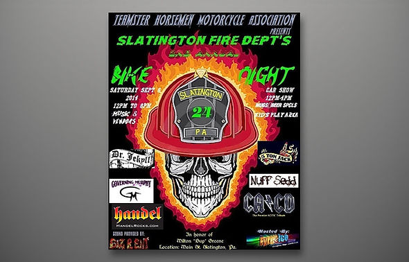
Before
We had a client who had another designer create a poster for the Slatington Bike Night and Car Show Benefit, however the designer created the image at a very low resolution and when the first print run began the final product was less tan desirable, blurry and unreadable.
We were asked to "fix" the image, however, because of the software and file type there was nothing we could do other than recreate the poster.
After
We really liked the idea of the original and wanted to keep a similar look and feel, but we also wanted to pull the audience into the poster by using more compelling artwork.
The final design on the right was printed on posters, banners, t- shirts and mugs. We also landed several other jobs for the borough of Slatington because of the execution of the piece.


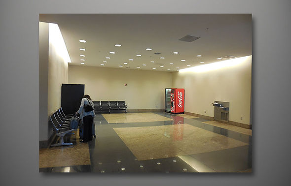
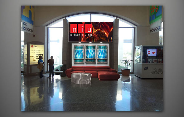
Before
Selling space in airports is never an easy task. Here is completely dead space in McAllen International Airport.
We pitched ideas to several clients whom the airport had been trying to persuade utilizing this space as a functional, environmental advertising space.
After
NIU Urban Living, a high-end furniture retailer specializing in post-modern home furnishings was very interested in the idea.
After many conversations with two of the top brass, we devised a brief and executed a space that showcased some of their favorite pieces. It served as an advertising space and a place for travelers to sit and rest, get a feel for the quality of the furnishings and get up close and personal with NIU.
This kiosk generated a 12% increase in revenue for the client in the first two weeks. It also generated tremendous advertising profit for McAllen airport.

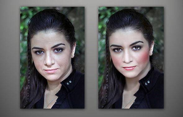
Before and After
This is what happens when you take a pretty girl and make her flawless. By evening out the skin tone, cleaning up the complexion, brightening the eyes and the teeth are all tricks of the trade.
We've also done a lot of major photo retouching on old, torn and waterstained family heirloom photos. What people once thought was ruined forever actually turns out better than the before pictures.
Before and After
When the band Beyond Eden was ready to cut their first cd, the lead singer and keyboardist, Phoenix, loved this picture (not taken by us), but was apprehensive to use it because it wasn't cd cover quality.
It didn't take long to take the photo to the quality that she expected, thanks to some photo pamipulation. Again, the complxion was cleaned up, the circles under the eyes and frown lines were glossed over and a bit of make up was added in post production.

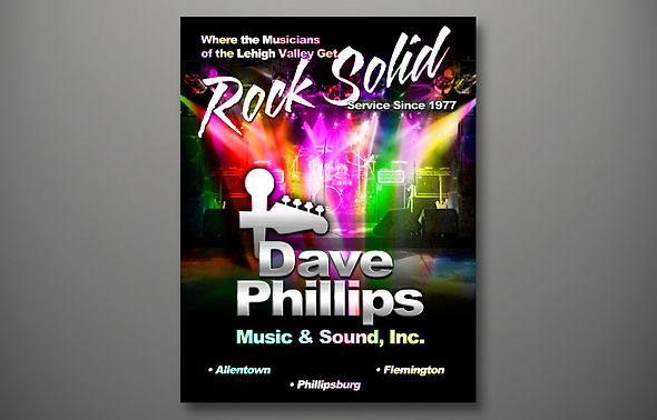
Before
Dave Philips Music & Sound has been a mainstay in the Lehigh Valley since 1977. When they decided to start selling through catalogue exposure, somebody created this cover for the catalogue.
We felt the readability was poor, the graphics too distorted and it really didn't speak to potential instrument buyers and musicians.
After
By using DPM&S products were were able to stage a full band set-up sans people, as we wanted this cover to scream equipment.
We already liked his logo but dressed it up a bit. By changing the emphasis in the tag line by utilizing different typefaces, the message now had a double entendre and really pulled the potential consumer into the catalogue,